−Table of Contents
Comparing Data Sets
Introduction
This tutorial is going to describe comparing different data sets. In this example, we're going to compare data between various subjects.
Download
The sample files can be downloaded here.
- Data:
- Sub 01 CMZ
- Sub 02 CMZ
- Sub 03 CMZ
- Scripts:
- Tag.v3s (Example script that can be used to tag the files)
- Tag_Loop.v3s (Example script that can be used to tag the files using a For_Each loop)
- Overlay.v3s (Example script that can be used to overlay the report template with another subject)
- Overlay_Loop.v3s (Example script that can be used to overlay the report template with another subject using a For_Each loop)
- Report Templates:
- Report_Template_ALL_FILES.rgt
- Report_Template_Sub_01.rgt
Prepare the Workspace
The first step is to load the data. It's recommended that you use the CMO Library to view multiple CMZ files at once. Many users simply choose to do a File → Open if they're viewing two small files. This option works for smaller data sets, but it's really recommended to use the CMO Library instead.
View files using the CMZ Library
- CMO Library → Set CMO Library Path
- Select ..Comparing Data Sets\Data folder
- Click OK
- CMO Library → Browse CMO Library
- Select Yes
More detailed instructions to load the CMO Library can be found here.
Tag Files
There are a few ways to create tags: (Choose one method of the following)
- Manually add tags to the files or use the pipeline.
- Use the Assign_Tags_To_File command to assign tags to subjects based on the filename. This can be done using the provided Tag.v3s file.
- Using the For_Each command, you can loop over all the subjects in your workspace to create individual tags for them. This can be done using the provided Tag_Loop.v3s file.
Graph Data
Once the data has been loaded and tagged, create a report template that plots the data.
1. Change Report Template to Plot Sub_01 tag
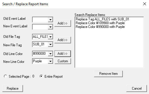
A. Open a report template that plots the signals you are interested in viewing (ex. Open provided Report_Template_ALL_FILES.rgt) B. Change the tag from ALL_FILES (or whatever you're currently plotting) to one of the tags you want to plot (ex. Sub_01) and set the line color to the same for both the right and left sides. a. Search/Replace:
D. Save report template (ex. Report_Template_Sub_01.rgt)
2. Overlay other subject's data
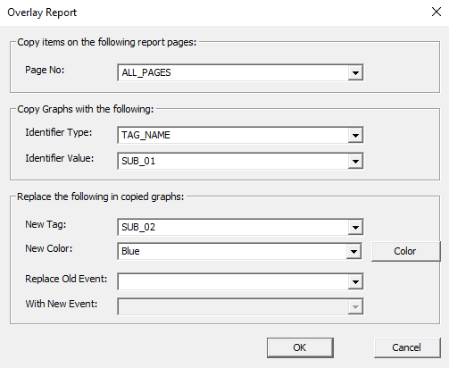
The step to overlay the subject data can be done manually (as described below), or using the pipeline (ex. provided scripts from download Overlay.v3s or Overlay_Loop.v3s).
A. Overlay Sub_02 on top of Sub_01 a. Overlay Report:
| a1. Page No: ALL_PAGES a2. Identifier Type: TAG_NAME a3. Identifier Value: Sub_01 a4. New Tag: Sub_02 a5. New Color: Blue |  |
B. Overlay Sub_03 on top of Sub_01 a. Overlay Report: a1. Page No: ALL_PAGES a2. Identifier Type: TAG_NAME a3. Identifier Value: Sub_01 a4. New Tag: Sub_03 a5. New Color: Cyan C. Display the tag name in the Legend of the report

